The Sumptuous Marriage of Blue and Gold
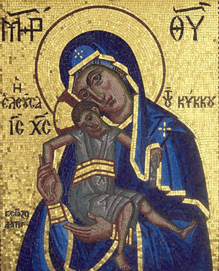
Byzantine example: icon from Kykkos Monastery, Cyprus where frescoes and mosaics adorn the walls and floors (c.1100 AD).
For centuries blue and gold have been married together in art. It is difficult to ascertain why artists choose certain colours for their compositions, we can only infer their reasons. Examples of these two colours being used together can be traced back to the Byzantine period, which spanned several centuries between c.330-1453. Artworks in this movement were of religious, devotional subject matter and were largely produced in tempera (egg) paint, fresco (onto fresh plastered walls), or mosaic. A key characteristic was their sumptuous use of gold, which often decorated the backgrounds of the images, whilst blue coloured the figures’ drapery.
During the late Middle Ages there was one particular artist who completely revolutionised and transformed Byzantine art. This was the Italian genius Giotto. He too incorporated vast amounts of blue and gold into his work, but unlike his contemporaries, he injected his figures with a more believable sense of three dimensionality and weightiness, as well as a suggestion of individual personalities.
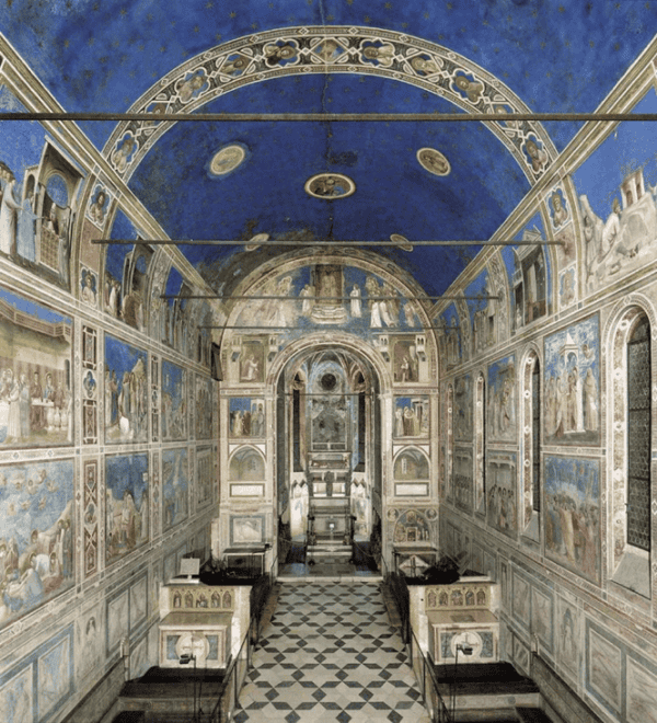
The interior of the exquisite Scrovegni chapel in Padua, Italy containing frescoes by Giotto (c.1305).
One of his greatest masterpieces in which these two colours are perhaps most prevalent is the Scrovegni chapel in Italy. In German, this could be called a gesamtkunstwerk, a total work of art. An ode to blue and gold, Giotto fresco painted the entirety of the walls and even the ceiling with attention to these colours, depicting more than one hundred scenes from the Bible.
“Ultramarine blue is a color illustrious, beautiful, and most perfect, beyond all other colors…And let some of that color, combined with gold, which adorns all the works of our profession, whether on wall or on panel, shine forth in every object.” Cennino Cennini, The Craftman’s Handbook, 15th century
Instead of painting the backgrounds with gold like other Byzantine artists, Giotto immersed his figures within blue backgrounds but incorporated gold in details such as their halos. Crushed lapis lazuli (from the semi-precious stone) was used for some of the blue, however he also included pigment from azurite, a cheaper substitute to lapis, as it would have been financially impossible otherwise.
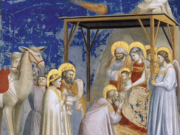
Frescoes inside the chapel by Giotto, completed c.1305. Top image is a depiction of The Expulsion of Joachim from the Temple and the bottom portrays The Adoration of the Magi.
The ceiling is enveloped in ultramarine blue, spangled with painted golden stars. In doing so, Giotto creates a ‘palpably blue environment’ that is ‘brilliant and luminous to such a degree that many viewers have remarked it is as if the sky had been brought inside’ including the author, Stella Paul in her book, Chromaphilia: The Story of Colour in Art.
Blue and gold would have been conceived of as the most appropriate colours to convey the supremacy of the heavenly realm as they were both such precious materials. Gold is an expensive metal that never tarnishes or fades and blue was from the semi precious stone lapis lazuli, which had to travel long distances from Afghanistan. Both colours were rare and costly, with an illustrious history having been embedded into the funerary mask of Tutankhamun in Ancient Egypt. Therefore, when the colours were included in artworks, the status of both the artist and the work was immediately elevated.
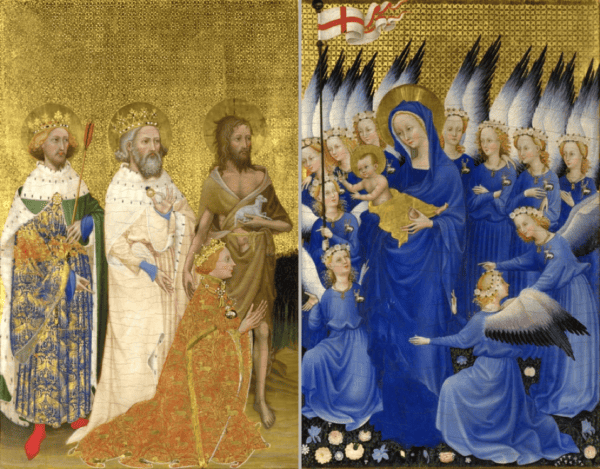
The Wilton Diptych, by an unknown artist (about 1395-9), egg on oak. The National Gallery, London
At the National Gallery’s Sainsbury Wing in London, you can see the magnificent Wilton Diptych, painted by an unknown artist. This small altarpiece is covered in blue and gold and reveals the most incredible craftsmanship. Lapis blue covers almost the entirety of the right hand panel in the clothing of the Virgin Mary and her angels, a colour commonly associated with the heavenly realm. It can also be seen on the clothing of the figures on the left: Saint Edmund wears regal robes of blue and gold and Saint Edward the Confessor, pictured in the middle, exposes blue sleeves under his white robe. It may be that the Saints wore blue to honour the Virgin Mary. The white hart all the angels wear on the right is also emblazoned on the kneeling Richard II, who commissioned the painting.
Another key reason why artists liked gold was due to its ability to reflect light and so cause surfaces to appear as if they were shimmering. This leads us onto illuminated manuscripts…. Characteristic of these beautiful handmade books was their decorative use of gold. The Dutch miniature painters, the Limbourg brothers, created a famous manuscript called Les Tres Riches Heures du Duc de Berry, which favoured both blue and gold amongst other rich and exuberant colours. It contained prayers but also acted as an illustrative calendar which had narrative depictions of each month and season, showing aspects of the French court. The gold used serves in emphasising the opulence of courtly life, and to reinforce the pious, erudite status of the Duke of Berry.

Les Très Riches Heures du duc de Berry, December
Above each month is a lunette, in which zodiac signs are depicted in lapis lazuli and gold, with the sun’s golden chariot illustrated as it makes its yearly cycle through the heavens.
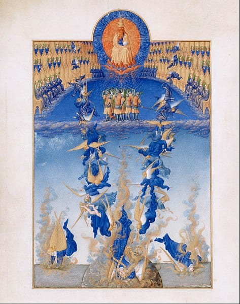
Les Tres Riches Heures du Duc de Berry, 1411 – 1416. A prayer page, The Fall of the Rebel Angels. Tempera on vellum.
Much later, artists continued to use gold and blue for its ability to suggest a sense of otherworldliness and majesty. The Austrian painter Gustav Klimt is well known for his sensuous portraits. The son of a goldsmith, Klimt captured ghostly, ethereal looking women set against semi-abstract, ornamental backgrounds which were decorated with gilded patterns. Alongside vast amounts of gold he often integrated other colours such as blue. Klimt’s paintings still remain some of the most expensive in the world.
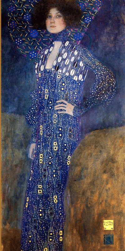
Klimt’s Portrat of Emilie Floge (1902).
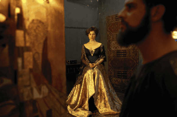
Still from the film Woman in Gold 2015 directed by Simon Curtis and starring Helen Mirren based on Klimt’s Portrait of Adele Bloch-Bauer I (1907)
The American artist James Whistler executed a series of paintings that focused on these colours. In 1859 he moved to London and for a long period lived near the Thames, south of Tower Bridge. Inspired by Japanese woodblock prints, Whistler made a series of paintings called Nocturnes, merging his interest in both music and art. The fifth in this series is Nocturne: Blue and Gold – Old Battersea Bridge, when below. It has been thought that Whistler’s aim in these works was to convey a sense of the beauty and tranquility of the Thames by night, which he seems to have partly achieved through his subdued blue palette and arresting sparks of gold. In this moonlit scene, gold signifies lights in buildings across the water as well as fireworks in the sky.
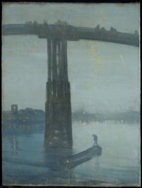
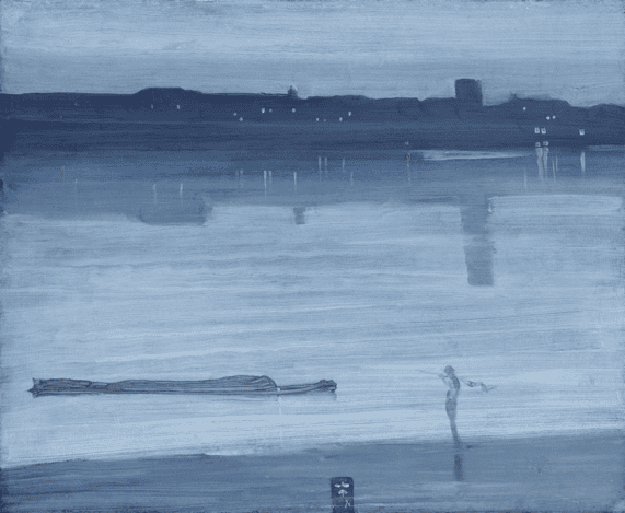
Whistler’s Nocturne: Blue and Gold – Old Battersea Bridge (c.1872-5) and below is Nocturne: Blue and Silver – Chelsea (1871).
So we can see that coupling of blue and gold has been favoured by artists for a very long time, bringing about wondrous effects. Medieval artworks still captivate us, potentially related to their makers’ meticulous attention to detail, passion for narrative and fervent employment of bold colours, from which artists have since continued to draw inspiration.