How Blue Makes us Feel…
Blue has historically been incorporated into the design of paintings and churches for its heavenly associations, which was intended to make people feel the metaphysical power of the celestial realm. However, blue has often been called on by artists for inspiration into deeper meanings; for its psychological impact on mood and emotion, for its association with tranquility and its ability to stimulate the creative senses.
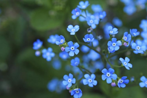
Forget me not flowers
It is a colour that has inspired many including painters, musicians and poets. In 1818 John Keats wrote a sonnet dedicated to blue called ‘Blue- Tis The Life of Heaven’. Here he expresses his absolute adoration of it, describing being surrounded by blue in all manner of the landscape from the heavens and skies to the waters. It represents life and even romance in many aspects of nature, as well as the celestial realm.
Blue! ‘Tis the life of heaven,–the domain
Of Cynthia,–the wide palace of the sun,–
The tent of Hesperus and all his train,–
The bosomer of clouds, gold, grey and dun.
Blue! ‘Tis the life of waters–ocean
And all its vassal streams: pools numberless
May rage, and foam, and fret, but never can
Subside if not to dark-blue nativeness.
Blue! gentle cousin of the forest green,
Married to green in all the sweetest flowers,
Forget-me-not,–the blue-bell,–and, that queen,
Of secrecy, the violet: what strange powers
Hast thou, as a mere shadow! But how great,
When in an Eye thou art alive with fate!
Wassily Kandinsky felt an emotional affinity with the colour blue and believed that the deeper and darker it was, the more it related to a supernatural sense of purity, opening up infinite possibilities, saying, ‘blue is the typical heavenly colour. / Blue unfolds in its lowest depths the element of tranquility.’ He projected some of his own personal meanings onto the colour, ascribing them to different sounds made by instruments. Around 1910 Kandinsky and another artist friend of his Franz Marc got together and published a collection of essays on modern art in Almanach Der Blaue Reiter (The Blue Rider). They arrived at this name because of a shared love of blue, which for them encompassed a mystical significance, as well as simply because Marc liked horses and Kandinsky riders and so the name naturally came about…
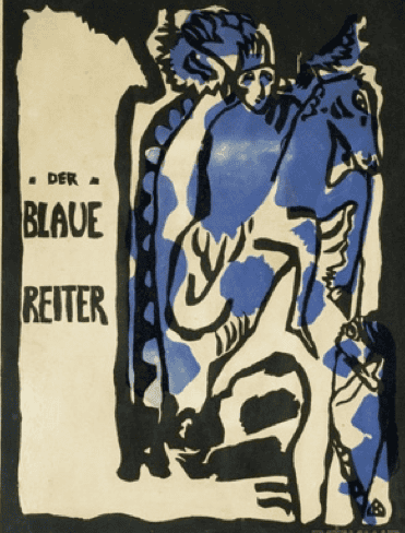
The Blue Rider Almanac cover 1911, Wassily Kandinsky. Watercolour and Indian ink and pencil on paper. The Städtische Galerie im Lenbachhaus
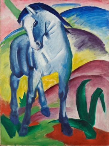
The Blue Horse 1911, Franz Marc, oil on canvas.
Around the same time as The Blue Rider the Romanian colour psychologist Stefanescu-Goanga conducted experiments and investigated the effects of colours on people in the early twentieth century. He concluded that people felt most calm when experiencing the colours blue and indigo. John Cage, in his book, Color and Meaning: Art, Science and Symbolism, records him saying that blue was ‘calming, peaceful, quiet and serious, nostalgic, cool and calm, or dreamy.’ The recording of these effects seemed to reinforce the suggestion that we feel colour before we intellectually engage with it. This discovery seems somewhat related to the neurological condition synaesthesia, in which the stimulation of one sense leads to the that of another and two sensations that are normally experienced separately are combined. For example this happens to some people who might feel the colour blue is associated with a certain number or day of the week.
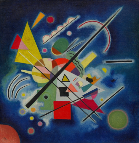
Blue Painting 1924, Vasily Kandinsky, oil on canvas. Guggenheim
Between 1925-1927 Joan Miro departed from his figurative style to more abstract symbolism, in which the colour blue was predominantly adopted. The paintings he created between these years are often referred to as ‘dream paintings’ or ‘peinture-poesie’ (poetry-painting) as they reflect his interest in dreams and the subconscious. Miro’s painting Photo: This Is The Colour of My Dreams, directly reveals how the colour blue permeated the artist’s thoughts and subconscious mind. To him it seems it referred to a higher state of consciousness; to a light airiness and peacefulness. It becomes apparent that he was an artist who was very sensitive to its subtle nuances, often equating it with a higher, subconscious realm.
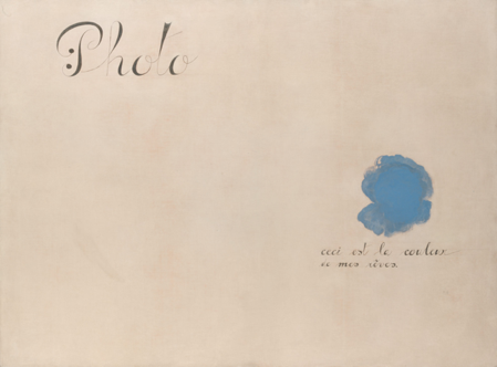
Photo, This Is The Colour of My Dreams 1925, Miro. The Metropolitan Museum of Art.
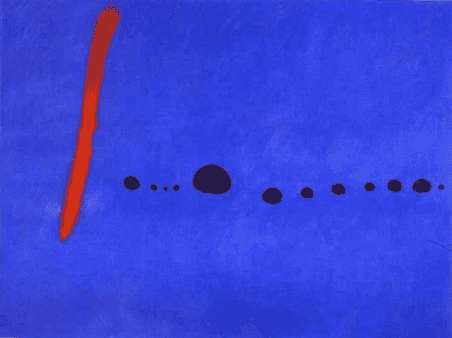
One of Miro’s paintings from his Triptych Bleu I, II, III, 1961. Musée National d’Art Moderne, Paris
The French artist Yves Klein was completely transfixed by the colour blue, dedicating much of his artistic career to it in several different ways. In his mid twenties Klein was searching for the perfect blue and made several paintings that consisted purely of ultramarine which ‘shimmers and glows’, intended to be interacted with as ‘experiences’ rather than paintings. He later coined this blue as his own, calling it ‘International Klein blue’. The artist chose this vibrant hue in his diverse body of work to express his idea of art as a rarefied sensorial experience, using pure colour to transcend reality and reach an immaterial, spiritual beyond.
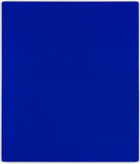
International Klein Blue
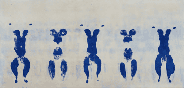
Yves Klein staged a performance piece in front of an audience, in which he used naked woman as ‘human paintbrushes’, who covered themselves in blue paint as Klein directed them as they pressed themselves on large pieces of paper to make his Anthropometry paintings in 1960.
In a kind of chain of inspiration, the filmmaker Derek Jarman was completely moved by Yves Klein’s paintings when he saw them at the Tate. Jarman was inspired to make an experimental ‘blue film’, that was dedicated to the artist and colour. The single monochrome frame of blue which makes up the film was actually derived from a photograph of one of Klein’s ultramarine blue paintings. There is no other moving visual composition to the film, it is only of a still and unchangeable blue. It was made in 1993, at a time when Jarman was actually beginning to lose his sight after contracting Aids and strangely, often saw blue light. Intended to be a sensory experience, the 79 minute shot of the colour blue is accompanied by narrators voices and ambient music. The absence of images can instead cause viewers to think their own imaginative thoughts they may project onto it, sparked by the colour and sounds of the voices…
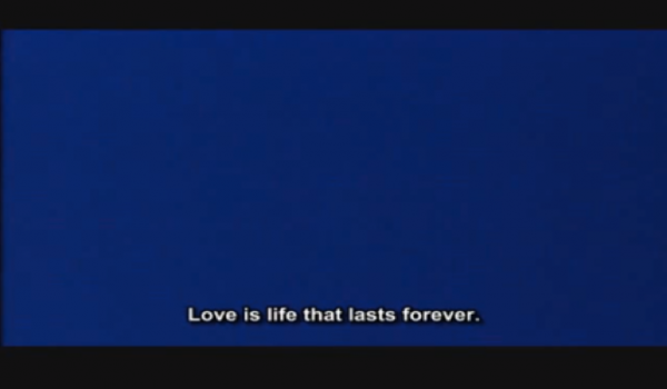
Still from Blue 1993, by Derek Jarman